Back to Work

Zeva

Redesigned the user flow based on usability heuristics. Designed hi-fi wireframes and a design system.

UX Research UX Design UI Design
Zeva App

Project Details

Role

UX Research & UI Design

Type

App Redesign

Domain

Healthcare / Telemedicine

Usability Evaluation

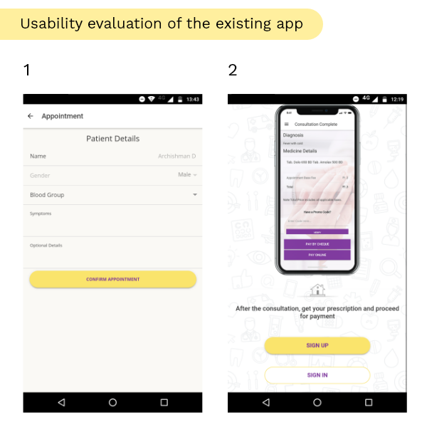
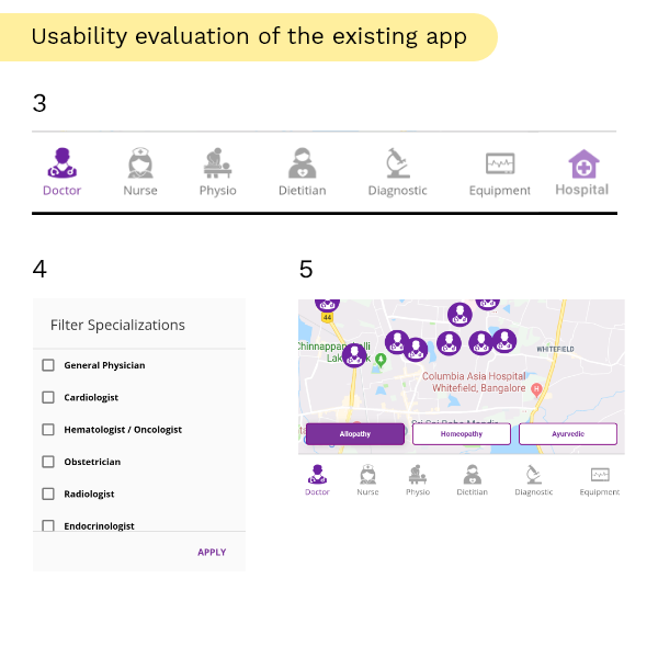
The evaluation revealed several usability heuristic violations that were impacting the user experience.

Usability Finding 1

Key Findings

  1. Recognition Rather than Recall: Instead of being able to select previously saved patient details, users had to fill this in every time.
  2. "Don't be UI literal" - Material Design Guidelines state: Don't show app UI if users haven't experienced it yet. Show the user benefit first. This was exactly the case in the existing app.
Usability Finding 2

Navigation & Filters

  1. Bottom navigations should not have more than five destinations, as per Material Design. There were seven destinations in the existing app.
  2. Flexibility and Efficiency of Use: There were over 53 filters with no search available. Only 6 filters were visible at a time.
  3. User Control and Freedom: While the default view showed "all doctors", the user could not return to this view after selecting a filter.

User Testing & Ergonomics

User Testing

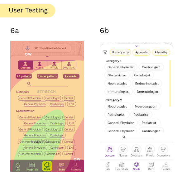
Based on user testing with the initial wireframes, it was observed that 8/15 users wanted to search first, and 7 of them needed to stretch their fingers to reach the search bar.

The image showcases the thumb zones with the initial wireframes (6a) and the updated design (6b) where the search bar was repositioned for better ergonomics.

Interested to know more about this project?

Connect