Back to Work

Case study / Wikipedia iOS app

Wikipedia app, Places tab

Making nearby places in the Wikipedia app easier to understand.

I audited the Places tab in the Wikipedia iOS app as part of a five-week accessibility review. My goal was simple: if someone uses VoiceOver, larger text, or touch accommodations, they should still know where they are, what places are nearby, and what action to take next.

Scope: Places tab Tools: VoiceOver, Figma, Contrast Checker Product: Wikipedia iOS app
Wikipedia Places tab showing list results while the Map control is selected.
The Wikipedia Places tab showing the map/list state mismatch that anchored the audit.

Project snapshot

A focused look at one high-friction part of the Wikipedia app.

Places is a small tab with a lot happening at once: a map, a list, search, filters, saved actions, distance labels, and location controls. That made it a good stress test for accessibility, especially because the screen has to work both visually and through VoiceOver.

5 weeks from kickoff to recommendations and final presentation
3 audit lenses: VoiceOver, visual clarity, Dynamic Type
2 personas: cognitive and visual disabilities; motor and temporary disabilities
1 Places-specific strategy for accessible map and list navigation

Problem statement

The Wikipedia app showed nearby places, but VoiceOver did not always tell the same story.

The problem was bigger than a missed label. A Places screen only works when people can trust the current view, understand what is nearby, and move through results in a sensible order. During the audit, that trust broke down in a few important moments.

State mismatch between tab and result view

High impact

Sometimes the app looked like one mode and sounded like another. That is especially disorienting in Places, because the map/list switch changes how people understand everything on the screen.

1.3.1 Info and Relationships 2.4.3 Focus Order 4.1.2 Name, Role, Value

Spatial context was visible but not reliably announced

High impact

Distance and direction are not decorative metadata here. They are the reason a nearby-place result is useful, so skipping them makes the list much harder to judge.

2.1.1 Keyboard equivalent 4.1.2 Name, Role, Value

Liquid Glass increased contrast and legibility risk

Medium impact

The new visual style made some text and controls feel too delicate. If the background changes, a subtle button or label can go from polished to hard to read very quickly.

1.4.3 Contrast Minimum 1.4.11 Non-text Contrast

Research process

I tested the screen the way real users would run into it.

I moved between the live app, VoiceOver, Figma notes, and the team deck. Instead of treating issues as isolated defects, I asked what each one would feel like for someone trying to quickly find a nearby Wikipedia place.

Kickoff

Aligned with the team on the Wikipedia discovery flows we were responsible for reviewing.

Research

Grounded the audit in two user personas and the new iOS visual direction.

App audit

Tested Places with VoiceOver, visual review, larger text, and touch target checks.

Synthesis

Sorted what I found by user impact so the Places story did not get lost in details.

Recommendations

Turned the audit notes into changes a designer or engineer could use.

VoiceOver audit

Listened for what VoiceOver made clear, what it skipped, and where the order became confusing.

Visual audit

Looked at whether controls still felt readable and tappable against the map and dark interface.

Dynamic Type audit

Checked whether place names, distances, and controls could breathe when text got larger.

Key findings

The same Wikipedia screen became different experiences depending on how it was used.

Touch navigation, VoiceOver navigation, and larger-text use did not always line up. That gap mattered most in Places because location is contextual: people need order, distance, direction, and clear state to decide what to open.

1

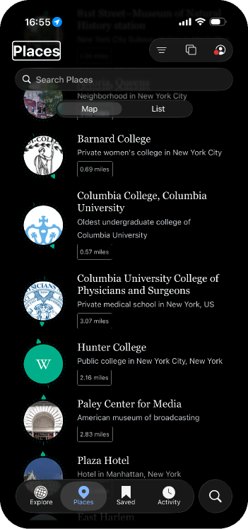
The selected tab did not always match the content.

When the app says one view is active but shows another, the user has to guess what state they are in.

Why it matters: a map/list toggle should reduce complexity, not add another layer of uncertainty.

2.4.3 4.1.2
2

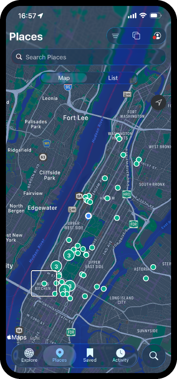
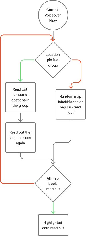
Map labels got in the way of useful places.

Road names and other background labels could become part of the VoiceOver path, even when they were not helping the task.

Why it matters: hearing extra map noise makes the real nearby results harder to find.

1.3.1 2.4.3
3

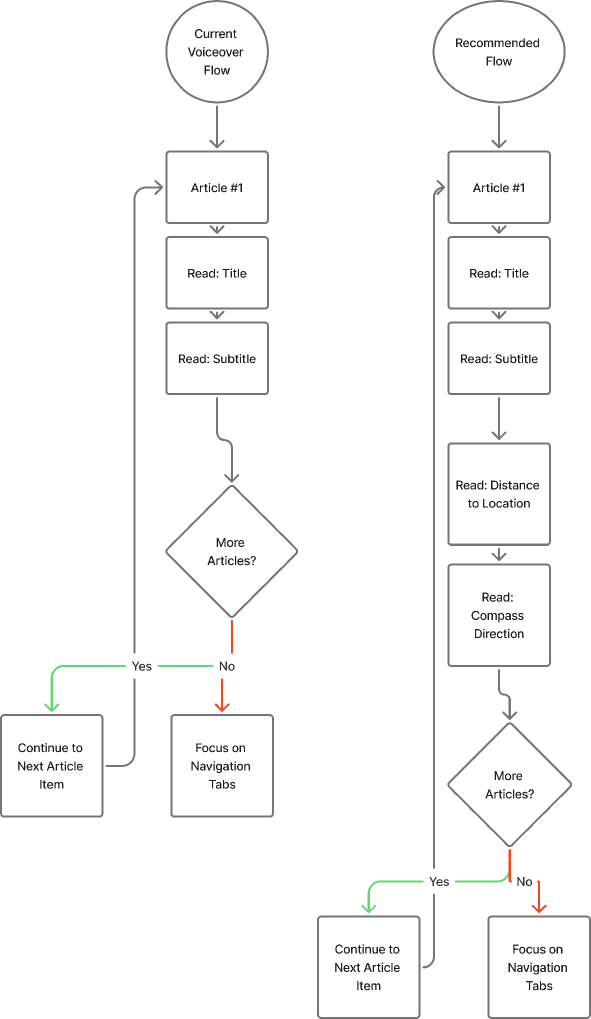
The most useful location cues were too easy to miss.

Distance, compass direction, and current location should sit near the front of the experience, not feel buried in the order.

Why it matters: nearby places only feel nearby when the app explains the relationship to where you are.

2.1.1 4.1.2
4

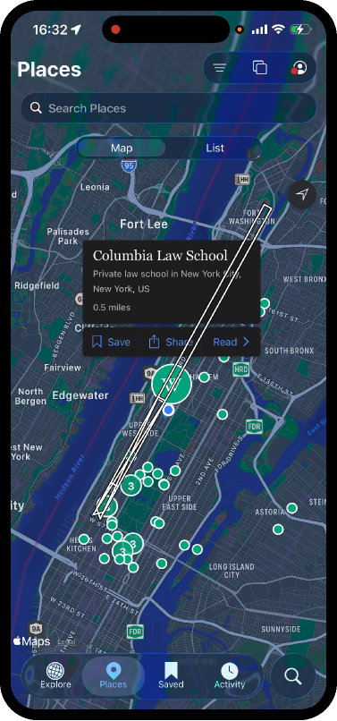
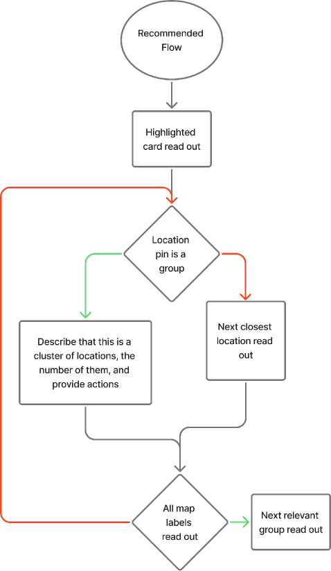
The screen focused pieces when it needed to explain the whole card.

Focusing an image alone does not tell the user enough. The useful object is the full place result with title, distance, context, and actions.

Why it matters: users should not have to reconstruct a card from separate fragments.

3.2.3 1.3.1
5

Some controls felt too subtle for a busy location screen.

Places has a dark interface, map imagery, translucent controls, and many small actions. That combination needs stronger contrast and touch spacing.

Why it matters: users should be able to identify actions quickly without hunting for them.

1.4.3 1.4.11
6

Larger text made the layout feel cramped.

When names, distances, and controls scale up, fixed-height rows stop feeling reliable. The result becomes harder to scan instead of easier to read.

Why it matters: text scaling should make the Wikipedia app more comfortable, not more crowded.

1.4.4 1.4.10 1.4.12

Audit evidence

Places screenshots from the team presentation.

These app captures show the Wikipedia Places tab in both list and map contexts, including the mismatch between the selected control and the information VoiceOver needs to explain.

Evidence model

I treated each issue as a product promise that was breaking.

The review became easier to communicate when each failure was framed as a broken promise: state should be stable, nearby places should be understandable, controls should be reachable, and visual information should remain legible under real accessibility settings.

S

State

Selected tab, rendered view, and VoiceOver announcement must describe the same state.

O

Order

Focus order should start with the most useful nearby places and expose current location early.

C

Context

Distance, compass direction, group labels, and card titles need to be announced together.

F

Flexibility

Cards and controls must survive larger text, touch accommodations, and contrast changes.

Proposed strategy

Give VoiceOver the same map logic that sighted users get visually.

The recommendation was to stop treating every visual object as a separate stop. In the Wikipedia Places tab, VoiceOver should first explain the meaningful result, then let people drill into actions when they need them.

Make map and list states explicit.

Keep the selected control, visible content, and VoiceOver announcement in sync.

Group pins and reduce map-label noise.

Let people move through nearby pins in a clear order, and keep background map labels out of the way.

Focus the full place card.

Read the title, distance, direction, and available actions as one meaningful result.

Design for resilient presentation.

Let rows grow, keep controls easy to tap, and make contrast strong enough for real map backgrounds.

Recommendations

What I would change next in the Wikipedia Places tab.

VoiceOver and interaction

  • Make Map and List impossible to desynchronize between the screen and VoiceOver.
  • Start with the current location and nearest useful places before reading background map detail.
  • Read a place result as one card: name, distance, direction, and available actions.
  • Confirm actions out loud when someone saves, filters, or switches views.

Visual, touch, and layout

  • Give text and active controls enough contrast on top of dark maps and glassy surfaces.
  • Keep map controls, filters, and row actions large enough to tap comfortably.
  • Let cards and metadata wrap instead of colliding when text size increases.
  • Make distance filtering genuinely useful for narrowing a long nearby-results list.

Reflection

What I learned from auditing Wikipedia Places.

This project made accessibility feel less like a checklist and more like the foundation of the product. In a location screen, state, order, and spatial context are the experience. When any one of those breaks, the whole screen becomes harder to trust.

Assistive technology parity has to be designed intentionally.

Touch users and VoiceOver users should be able to answer the same questions: where am I, what is closest, what can I do next, and what changed after I acted?

Evidence is more persuasive when it is specific.

The screenshots and flow diagrams helped me point to exact moments: the card split into pieces, the current-location control came too late, and map labels interrupted the task.

Liquid Glass raises the bar for resilient UI.

Translucent surfaces can look polished while weakening legibility. The audit reinforced that visual systems need accessibility tokens, contrast testing, and Dynamic Type checks built into normal review.

The outcome is a clearer handoff.

The recommendations now connect what users feel with what the team can change, without turning Places into a simpler or less useful feature.